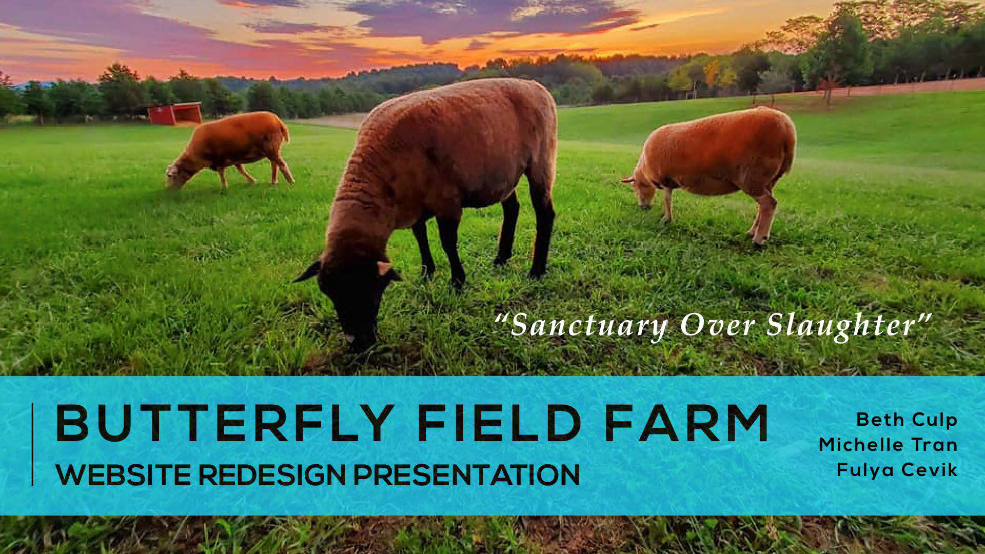
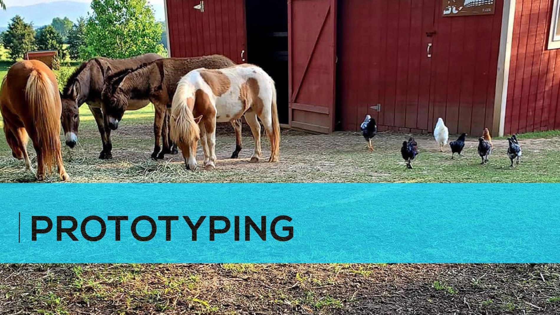
Butterfield Field Farm, Animal Sanctuary because farm animals are just as affectionate as your pets.
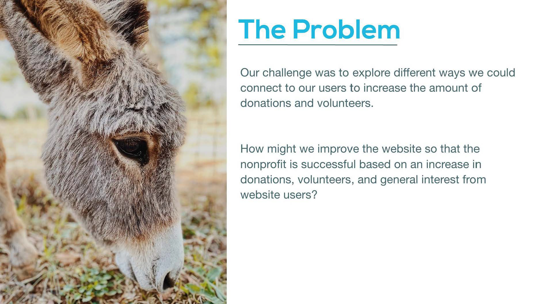
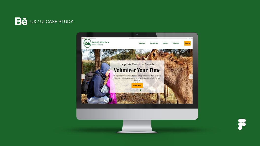
Butterfly Field Farm Animal Sanctuary’s website is designed to inform users about the organization’s current work and how they can interact with the org.
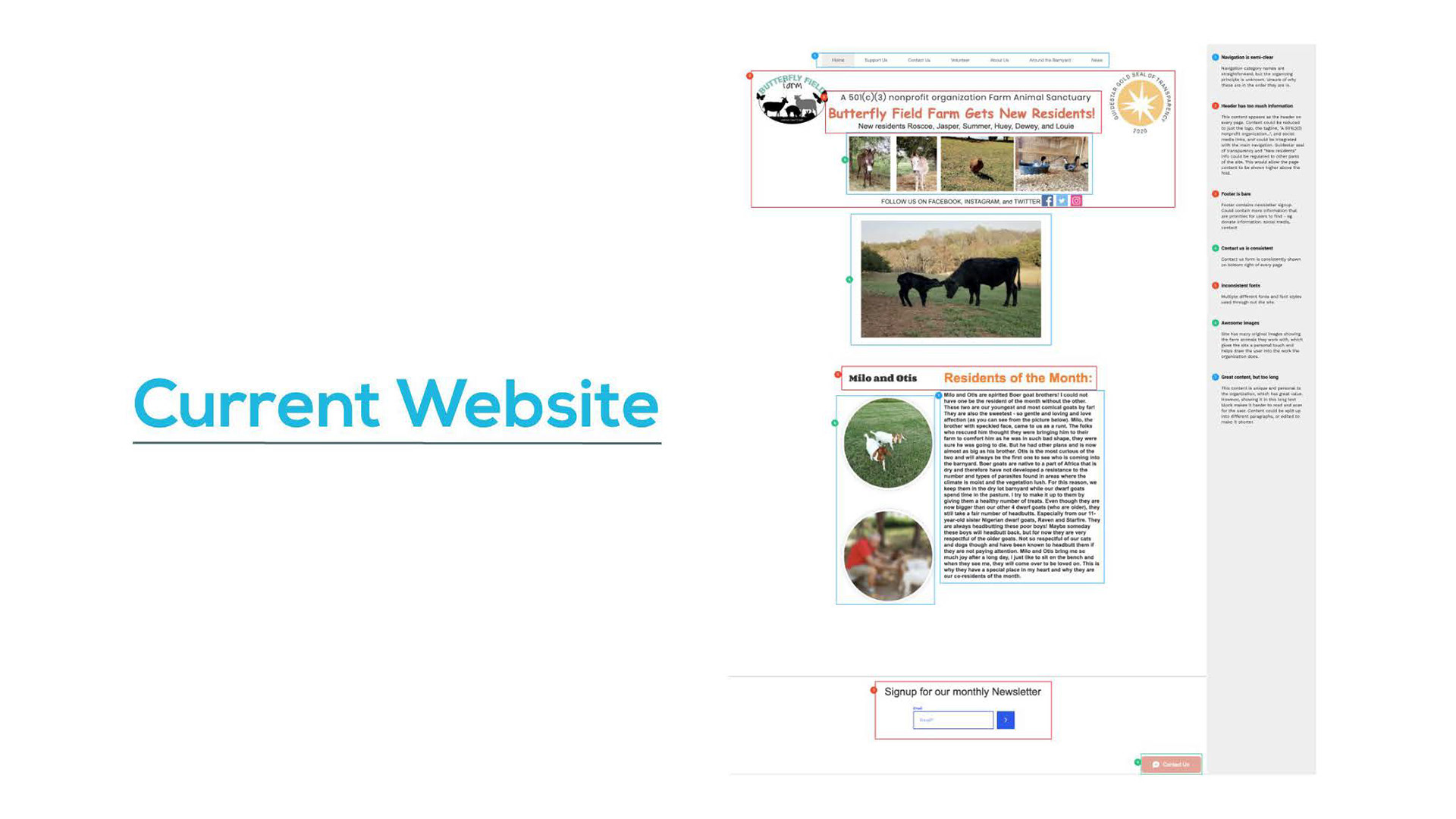
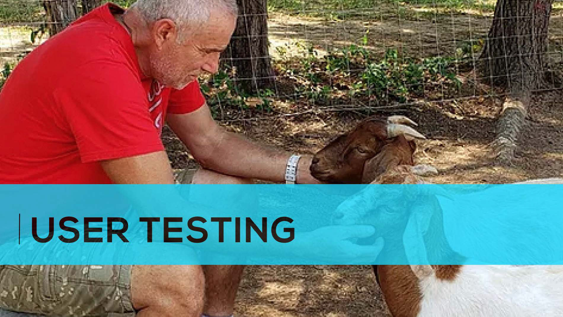
We conducted a heuristic evaluation of the current website as well as guerrilla testing to find the areas we could improve upon. We also interviewed the owners of the organization through Zoom to find out their goals and current pain points with the site.
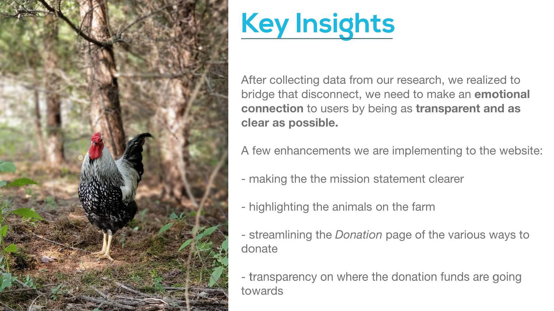
From looking at other animal farm sanctuary nonprofit websites, we realized there was a lack of emotional connection from our nonprofit’s site.
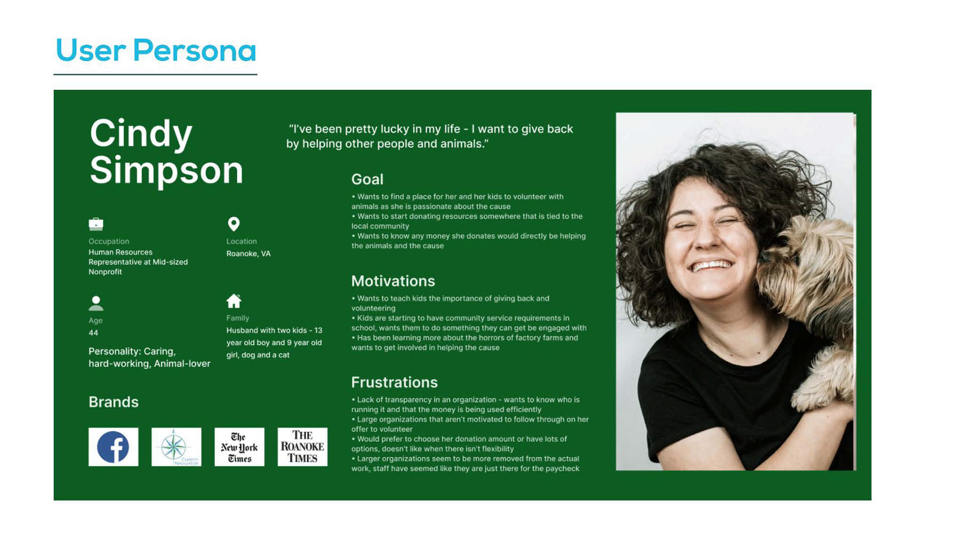
Highlighting our ideal user persona,
she’s a middle aged woman that lives close enough and wants to volunteer for a nonprofit that’s transparent about their mission statement and where the donation funds are going.
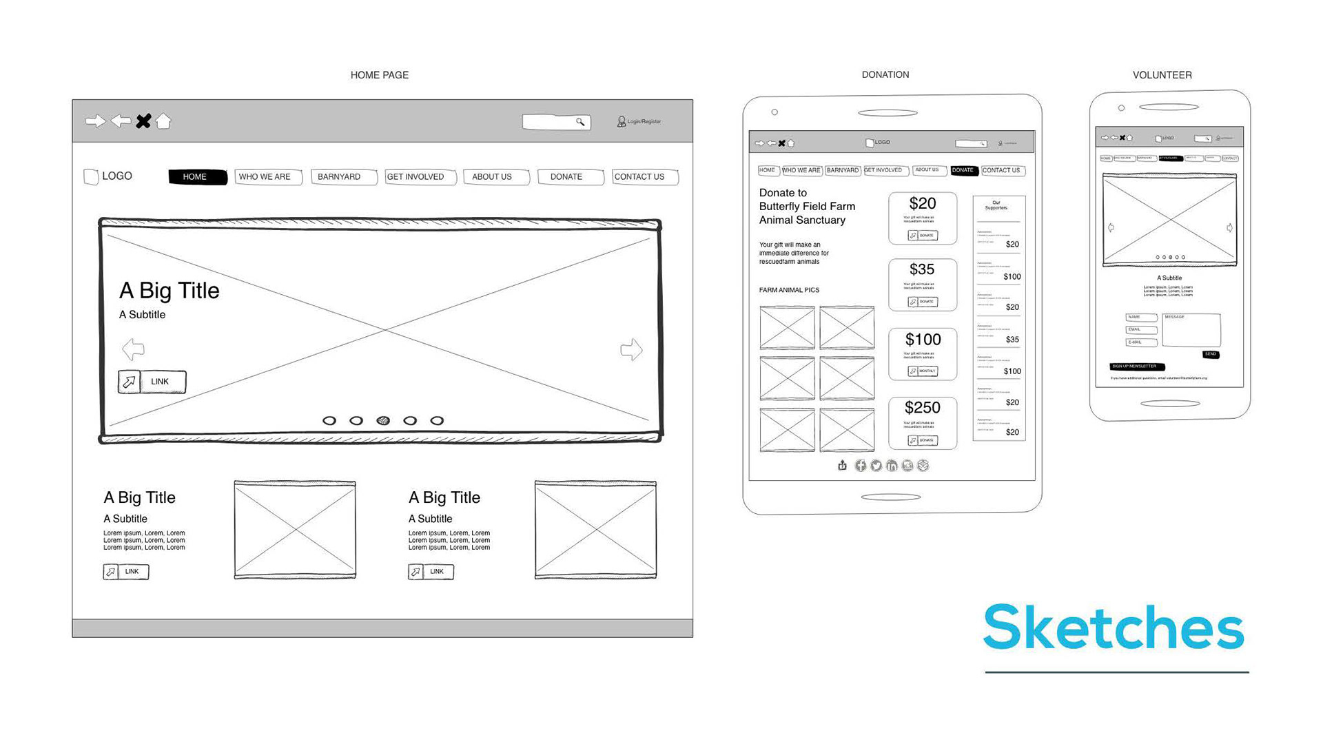
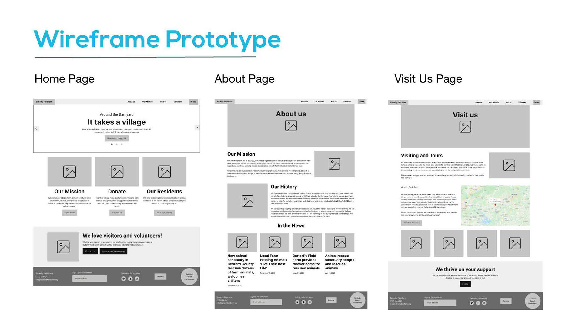
After our research, we started ideating. Here are a few sketches we mocked up of a few different pages for different devices. We have one for a desktop version, tablet version, and mobile version.
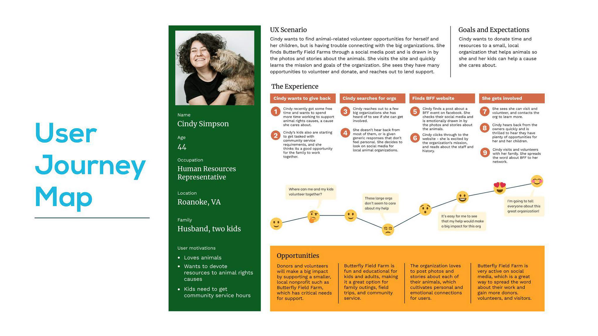
Taking you through our user journey, Cindy’s kids are required to complete community service for school. She reaches out to a few larger orgs and doesn’t hear back from them. She comes across a Facebook event for Butterfly Field Farm and explores their site to learn more about them. With her interest peaked, she reaches out to visit and quickly hears back from the excited founders. Her and her kids spend time volunteering on the farm and from that awesome experience, she tells her network about the nonprofit.
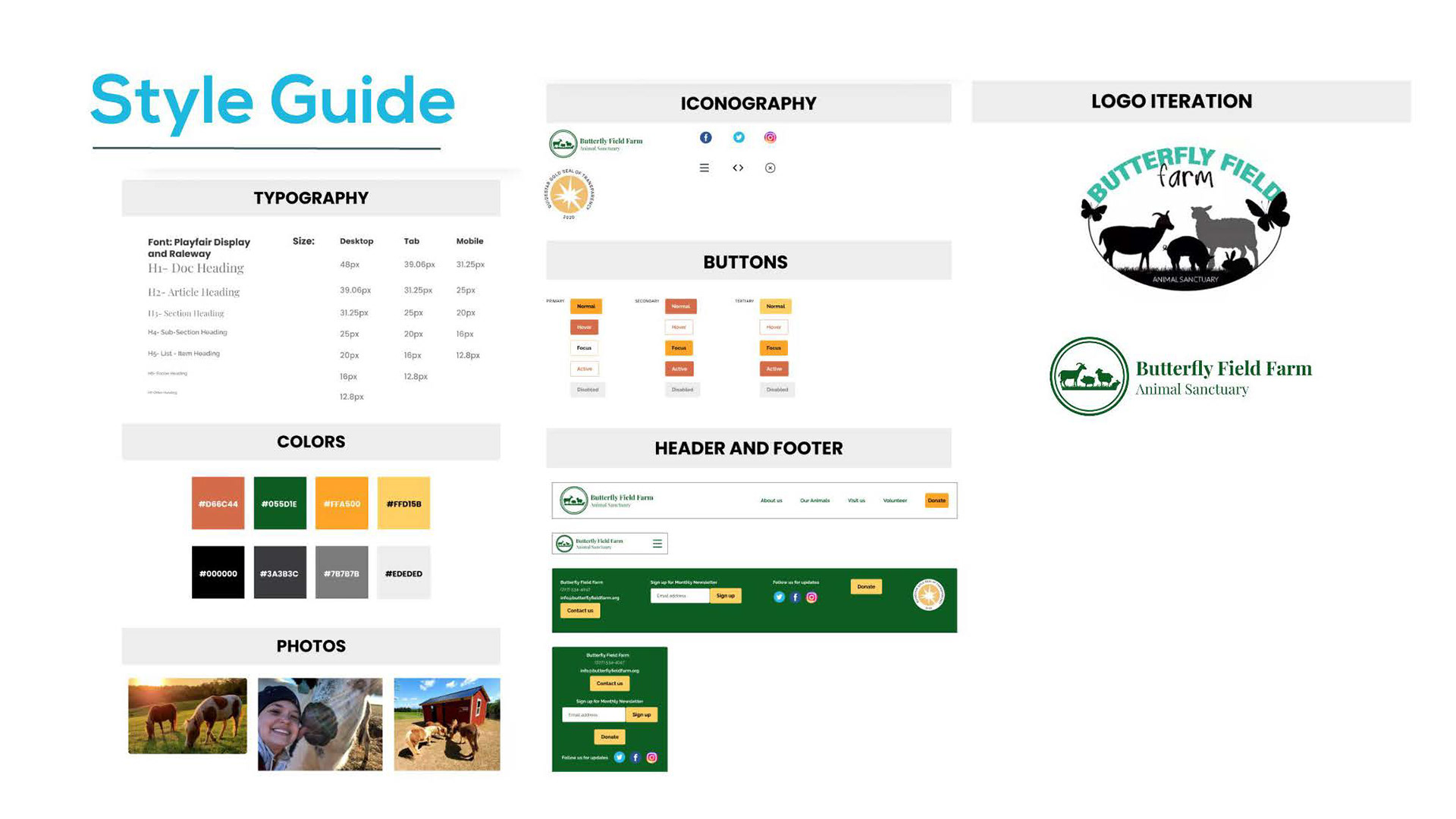
After prototyping, we nailed down our style guide. We choose these colors to project an earthy, calming, but refreshing atmosphere. We even redesigned their logo from the original one to a more simple, but clear logo so users can understand what kind of nonprofit they are just from the logo itself.
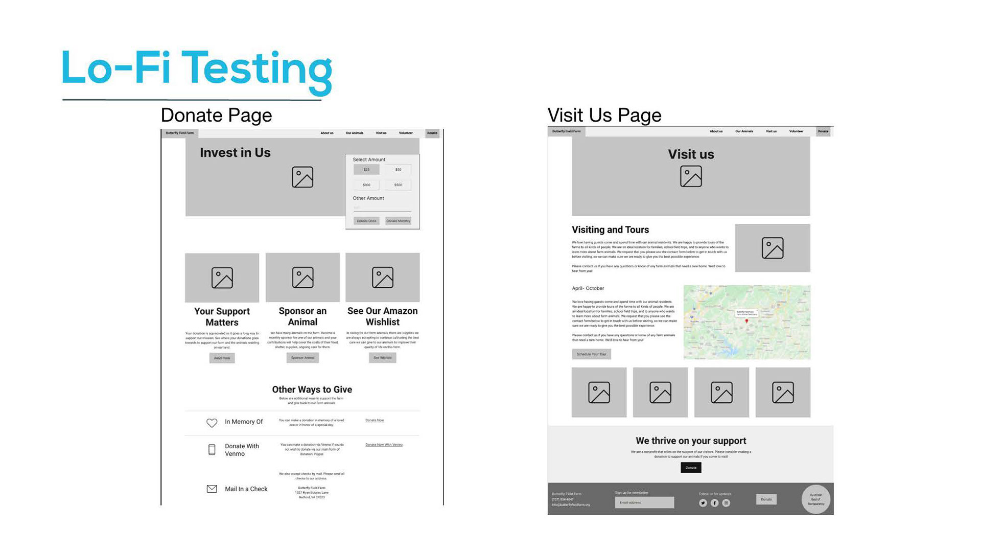
During our guerrilla testing of the current site, our users pointed out the current donation page was a little confusing with all the different ways to donate, and the Visit Us page was lacking some key info such as hours of operation, days they are open, contact information, etc. We created a lo-fi prototype and focused on adjusting the issues we found by reorganizing the Donate Page, and making visitor info clearer on the Visit Us Page.
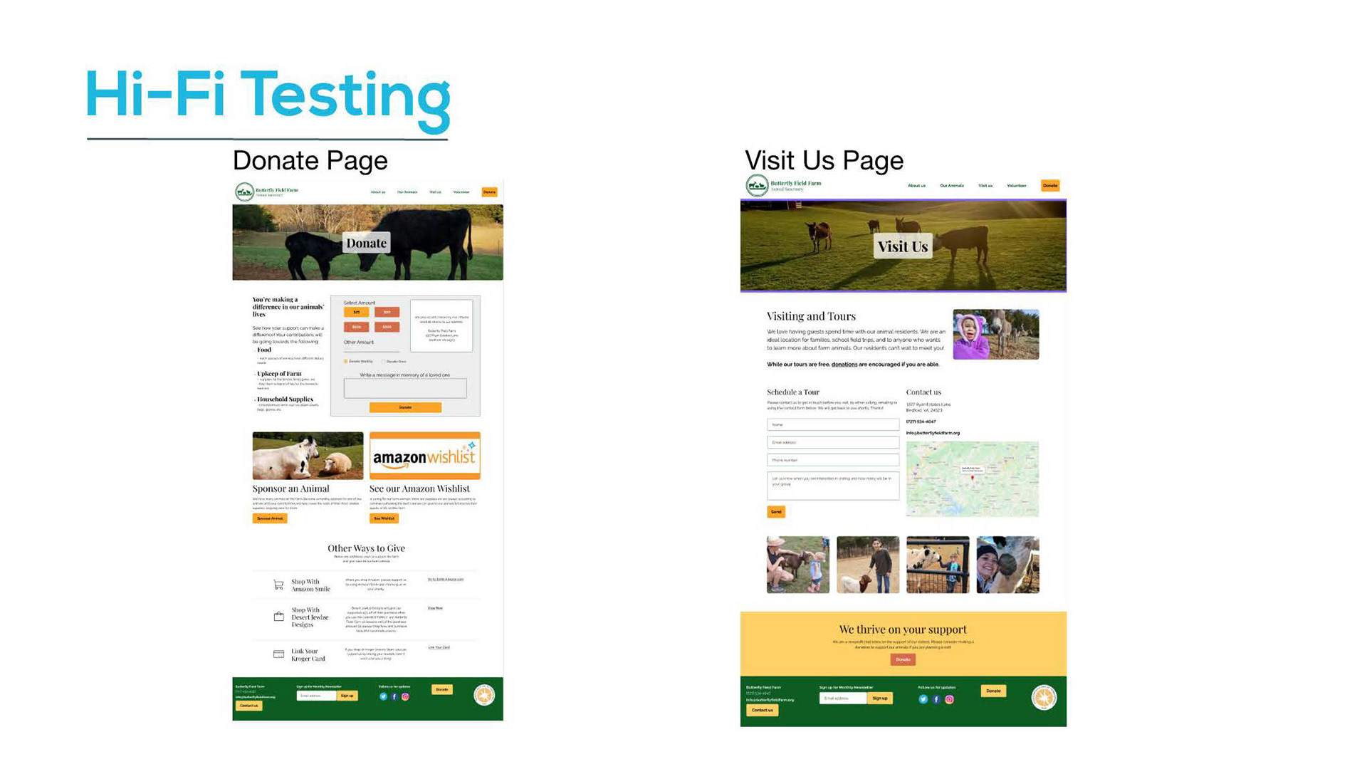
For our Hi-Fi prototype, we implemented our colors and fonts from our style guide.
After processing the key takeaways from our lo-fi testing, we continued to iterate on the prototype.
- Continued to tweak the donation page by moving the donation form down and rearranging the content to separate straight donations and animal sponsorships from the options to donate while you shop, such as Amazon Smile.
- Since the organization asks that visitors reach out to them before visiting, we added a contact form on the Visit Us page but also gave more background on how tours work and more general contact info
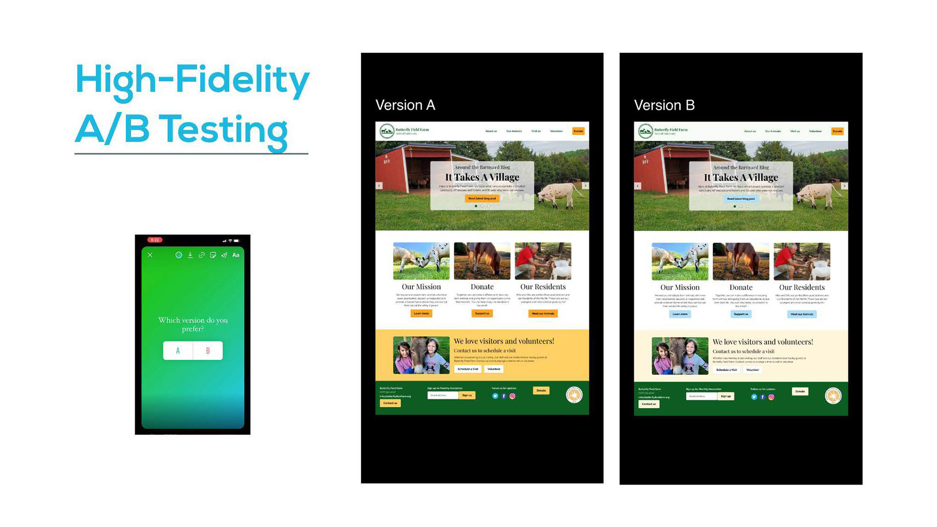
Per our instagram and with you all, most people picked Version A. Some felt the button color popped out more with Version A, whereas the button color in Version B blended into the background too much. We know calls to action are very important, so we went with Version A.
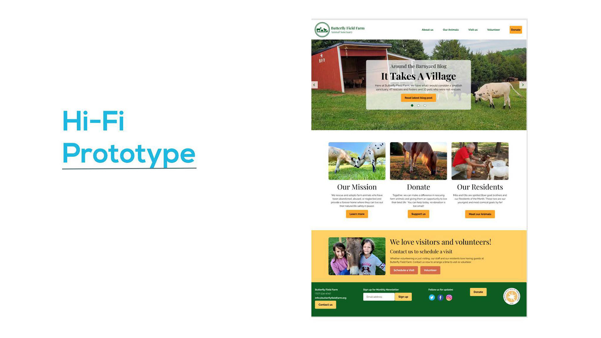
After making more adjustments from testing, we completed our hi-prototype, which I will demo for you now.
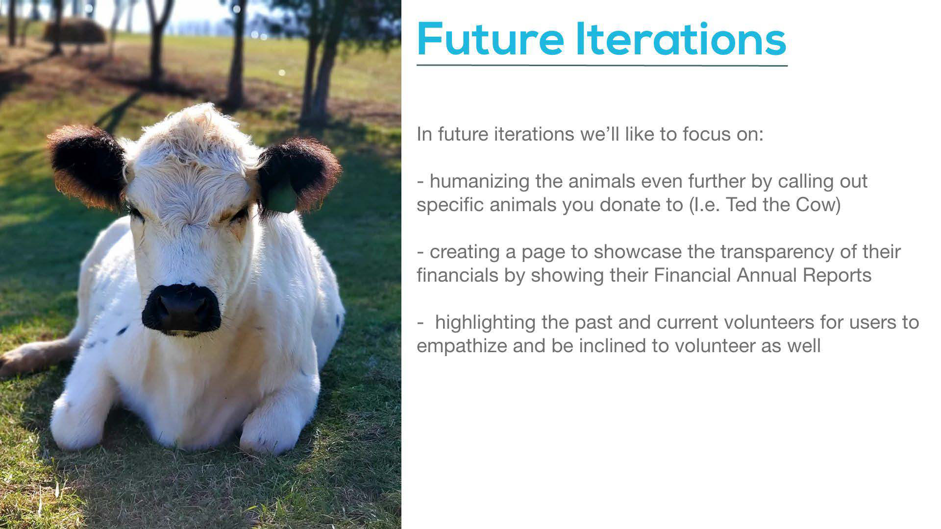
In the future, we’ll like to iterate the sponsor animal section on the donate page to showcase the different animals you can sponsor. Currently they have 50 animals on the farm so this is definitely a project for a future iteration!